Random
Reasons Small Businesses Need a Brand Identity System
Business and marketing experts urge small business owners to “brand” their businesses with a logo and a set of consistent marketing materials — a brand identity system. But they rarely explain the reasons behind this advice. A logo and consistent marketing materials can increase your sales and revenue, because they convey the following impressions:
- To convey that you are established. A logo and professionally-printed materials show that you are committed to both your business and your clients. It also makes you look like you’ve been around for some time, and that you’re stable.
- To attract more clients. Some clients look for a well-defined company, and “look and feel” may be one of their criteria in making a purchasing decision. Others are “wowed” by professional-looking materials, and your logo may impress them into buying.
- To increase your credibility. A logo makes you look experienced and professional, and can go a long way towards making your business appear credible. And, if you’d like to be known as an expert in your field, this type of credibility is the first thing you have to establish.
- To be more memorable. Forty percent of people better remember what they see than what they hear or read. So having graphics associated with your business and having consistent graphics on your business materials make you more likely to come to the forefront of potential clients’ minds when they have a need for your goods or services.
- To stand out in your field. A well-designed logo and an identity system can put you far above the competition, especially if they are paired with a strong marketing program.
- To look “bigger.” Home-printed business cards with perforated edges or cards printed with standard designs available through Microsoft software or online business card vendors scream “small-time vendor” to your potential clients—and that is how they will want to compensate you.
- To improve your chance of getting venture capital or selling a business. If you present a well-rounded business package, including marketing materials and graphics, your business will look more complete.
- To brand yourself. Especially if you are a consultant, you need a logo in order to build an image and a brand that is bigger than your individual identity. If you’re running a larger business, the logo will begin to create a “brand” or “face” for your business, and to personalize the larger business entity.
- To give clients a sense of stability. You may not have been in business “since 1908,” but if you have invested in an identity, you are much less likely to fold in the eyes of your customers. It goes a long way toward building that all-important “trust.”
- To explain your company name. If your company name contains a little-known word or an acronym, the logo can give visual clues to its meaning.
- To endear your company name to your clients. A difficult-to-pronounce or hard-to-remember company name may make it challenging for your clients to hire you. When potential clients have the need for your services, they might not recall who you are. But if you reinforce the name with interesting, compelling graphics, they are more likely to remember you, pick up the phone, and hire you.
- To describe an unusual line of business. If your business is nontraditional or in a hard-to-explain industry, a logo can help to explain exactly what it is that you do by offering a visual reference.
- To show what practices differentiate you from your competition. A well-designed logo can have many subtle meanings and can begin to tell the story of how you do business, including the special practices that make you stand apart from the competition.
- To comply with expectations. In some industries, a logo is just expected. In the creative services industry especially, having a logo is an industry standard.
- To show your commitment and for the sense of personal pride it will add to your practice. In other words, do it for yourself. A logo will increase your confidence, and that will show through in all of your business interactions and practices.
These benefits will boost your business and your confidence, so start thinking about developing a logo and identity as soon as possible.
souce: internet
Read Full Post | Make a Comment ( None so far )why do you need a logo designed for your business!!
You’re just starting your business. Opening a bank account, getting a business license, and setting up your office are top priorities. And, of course, the question of stationery and marketing comes up. If you’re starting a business, you need business cards. And probably stationery. And a website. All this means you need to design a logo immediately, right?
Maybe. But maybe not.
A lot of small businesses start out with one vision, but by the time they really start rolling, things may have changed. Services or products may wind up being modified to better match customers’ wants or needs. New product and service lines may get developed. You may discover, after you start making sales and talking to customers, that you’re doing things in a revolutionary way. You may be serving a different type of client than you’d originally envisioned—or solving a problem you didn’t expect to encounter for those clients.
Any of these factors can play a major role in your logo and brand design.
Starting out your business with your logo, stationery, and marketing materials all perfectly designed can certainly jumpstart your brand building process. But the key word here is “perfectly.” If your business is in the very beginning phase, you may not have had enough practice running it to know what it is really all about, so you can’t use that information to design the perfect brand.
Here are questions you can ask yourself to determine if you’re prepared to create your logo:
1. Do you have a solid plan that lays out exactly what you’re going to do in your business? If you’ve only sketched one out, or if it has gaps and holes, then waiting until those are filled in will result in a stronger logo and brand.
2. Are you committed to sticking to that plan? Or are you planning to stay flexible and make changes in your business as you try things out? If you’re willing to make changes, then those changes may mean that your brand ends up not matching your business—which means that the effort and cost invested in design and printing has been somewhat wasted. You have gained some value from your brand, but you have to do everything all over again.
3. Can temporary marketing materials work for your business, or will they detract from potential sales?How important is it that you get off the ground with your marketing materials finished perfectly? Don’t postpone the branding process if it will cost you customers or hurt your business. However, do be aware that if you try to brand too early, you may not design your brand correctly.
4. Have you started a business and/or created a brand before? If not, you may want to take it slow. Branding is easy to rush into, but it’s a major business decision. Waiting until your business is stable and established can really pay off.
If you have definite answers for these questions, then you may be ready for your brand. However, if you aren’t sure that you’re settled in your business and on its personality, services, differentiators, and target audience, it may be better to hold off creating a logo so that it will be as accurate and as lasting as possible.
souce: internet
Read Full Post | Make a Comment ( None so far )basic web designing
Source: internet
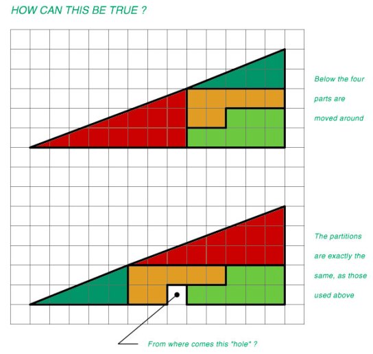
Read Full Post | Make a Comment ( None so far )Challenge to Geometry Puzzle any genius to solve this!
Here’s a puzzling new discovery:
Recently a professor in MIT has put a new theory on right-angled triangles that has challenged some accepted norms in Geometry. This theory, Prof. John Mentriffe says, will revolutionize area in mathematics that deals with calculation of motion objects in space and design of the Universe.
Chakradhar
www.chakradhar.net
http://zoomsays.blogspot.com


